


This article is part of our step-by-step guide to translating text in an image online. To translate your own picture right now, use our free image translator.
AI image translators can turn photos of signs, menus, documents, product labels, manuals, and other text into readable translations within seconds. But the quality of the translation often depends on something surprisingly simple: the quality of the original photo.
If the text is blurry, poorly lit, tilted, tiny, or partially hidden, an AI translator may struggle to recognize it correctly. Google specifically notes that image translation accuracy depends on text clarity and that small, unclear, or stylized text can produce less accurate results.
The good news is that you don’t need a professional camera to get better results. A smartphone and a few simple photography techniques are usually enough.
Here are the most important tips for taking photos that translate accurately.
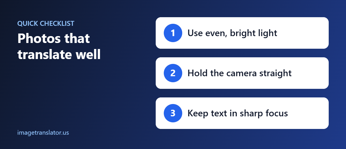
Use Good, Even Lighting
Lighting is one of the most important factors when photographing text.
A dark photo makes letters harder to distinguish, while strong reflections can hide individual characters. Shadows can also cover parts of words.
Whenever possible, photograph documents or objects in bright, even lighting.
Natural daylight can work well, but avoid placing the document directly under harsh sunlight if it creates glare.
For indoor photography:
- Turn on additional room lighting.
- Avoid casting your phone’s shadow over the text.
- Keep the light source positioned so it illuminates the page evenly.
- Avoid reflections from glossy packaging.
- Use your camera flash when the scene is too dark and flash does not create distracting reflections.
Google’s current image-translation guidance specifically recommends using flash in low-light conditions.
Avoid Extreme Contrast
A page with bright highlights and very dark shadows can be difficult for OCR systems to process.
For example, a photographed manual may have one side brightly illuminated while the other side is almost black.
Move the document or light source until the entire text area is reasonably evenly illuminated.
Hold the Camera Straight
Camera angle matters more than many people realize.
When you photograph a flat document from an angle, rectangular text lines can appear distorted. Letters near one edge may look smaller or stretched compared with letters on the other side.
For the best results, position your phone so the camera is approximately parallel to the surface containing the text.
For a sheet of paper:
Good: Camera directly above the page.
Less ideal: Camera held at a sharp angle from the side.
Keeping the camera straight helps maintain consistent character shapes and makes the text easier for OCR systems to analyze.
Microsoft’s OCR documentation identifies rotation and document scan quality among factors that can affect OCR accuracy.
Make Sure the Text Is in Focus
A high-resolution photo isn’t useful if the actual letters are out of focus.
Before taking the picture, tap the screen on the text area to help your phone focus on the words.
Look closely at the preview.
Can you clearly distinguish individual letters?
If the answer is no, take another photo.
This is particularly important for:
- Small instruction manuals
- Product labels
- Receipts
- Restaurant menus
- Signs
- Screenshots photographed from another screen
- Fine print
Remember that OCR has to recognize the characters before a translation model can translate them. If the letters are unclear, the translation process starts with incomplete or incorrect information.
Use the Highest Practical Resolution
Resolution determines how much visual information your photo contains.
A low-resolution image may cause small characters to become blurred or merge together.
If your phone offers multiple camera modes, use a normal high-quality photo rather than a heavily compressed image.
Don’t immediately resize a photo to a much smaller resolution before translating it.
This is especially important when photographing:
- Dense documents
- Technical manuals
- Small labels
- Tables
- Product specifications
- Multi-column pages
Microsoft notes that resolution, text size, contrast, lighting, and other image characteristics can all affect OCR performance.
But Bigger Isn’t Always Better
You don’t necessarily need an enormous image.
The goal is to capture clear, readable text at sufficient resolution.
A sharp 2000-pixel-wide image can be more useful than a blurry 5000-pixel-wide photograph.
Prioritize clarity over file size alone.
Move Closer Instead of Using Extreme Digital Zoom
If text is small, many people immediately use digital zoom.
Digital zoom can reduce image quality by enlarging pixels rather than capturing additional detail.
Instead, when practical, move the camera closer while keeping the text fully inside the frame.
For very small text, take a separate close-up photograph.
For example, if a product package contains a large instruction panel and tiny safety information, you may get better results from two photos:
Photo 1: Main product information
Photo 2: Close-up of the small safety text
This gives the translation system a clearer view of each section.
Keep the Entire Text Visible
Don’t accidentally cut off the beginning or end of a sentence.
Make sure the photo includes:
- The complete heading
- Full sentences
- All relevant lines
- Numbers
- Symbols
- Diagram labels
If a paragraph is cut off at the edge of the photograph, the translation system may not have enough context to interpret it properly.
For a large document, it’s better to take several overlapping photos than one distant photograph containing tiny text.
Avoid Glare and Reflections
Glossy surfaces are particularly challenging.
Product packaging, laminated documents, screens, and glossy magazines can reflect light directly into the camera.
A bright reflection may completely obscure several letters.
Try changing the camera angle slightly or moving the light source.
For example, instead of photographing a glossy label directly under a ceiling light, move the product until the reflection disappears.
If necessary, take several photos and choose the clearest one.
Use a Simple Background
A clean background can make text easier to isolate.
When photographing a document, place it on a relatively plain surface.
Avoid unnecessary objects around the page.
This is especially helpful when the document has text close to its edges.
For signs and product packaging, however, you don’t need to remove the surrounding environment if the text itself is clear. The priority is making the target text easy to identify.
Don’t Cover the Text With Your Hands
It sounds obvious, but fingers frequently cover small parts of labels and documents when people hold them.
Instead, place the item on a stable surface whenever possible.
If you need to hold it:
- Grip the edges.
- Keep fingers away from text.
- Avoid bending the document.
- Keep the camera steady.
This is particularly important when photographing small labels where even one covered word can change the meaning of an instruction.
Photograph Flat Documents as Flat as Possible
Curved pages and folded documents can distort text.
For manuals, receipts, certificates, menus, or instruction sheets, flatten the document before photographing it.
You can place it on a table and gently flatten the corners.
Avoid photographing a page while it’s heavily curled or folded.
Curved text can be more difficult for OCR because characters and lines no longer appear in their normal orientation.
Use Common, Clearly Printed Fonts When Possible
You can’t always control the font on a sign, package, or document. But when you’re creating an image specifically for translation, choose a readable typeface.
Google recommends clear, commonly used fonts for better image-translation results.
Highly decorative text can be more difficult to recognize.
This can affect:
- Handwritten-style fonts
- Decorative headlines
- Extremely thin fonts
- Distorted text
- Text placed over complex backgrounds
For business graphics that you expect customers to translate, simple typography can improve accessibility as well as machine readability.
Increase Contrast When You Can
Text should stand out clearly from its background.
Black text on a light background is generally easier to distinguish than light gray text on a slightly darker gray background.
When photographing existing material, you may not be able to change the colors. But you can improve the photograph by choosing better lighting and avoiding reflections.
If you’re preparing a document yourself, use strong contrast between text and background.
Keep the Phone Steady
Motion blur can turn sharp characters into streaks.
Hold your phone with both hands or use a stable surface when possible.
For particularly important documents, take two or three photos and choose the sharpest one.
You don’t have to use the first photograph you take.
Crop Before Translating When Necessary
Sometimes the best way to improve translation results is simply to remove irrelevant parts of the image.
Suppose you have a photograph of a restaurant menu containing ten sections. If you’re interested only in one section, crop the image around that text.
Similarly, for a product label, you can create a close-up of the instruction area.
Cropping gives the translation system a larger and clearer view of the relevant text.
Google Translate currently allows users to select portions of text in an image for translation, which can also be useful when an image contains multiple text regions.
Photograph Screens Carefully
Screens can create additional problems because of:
- Reflections
- Moiré patterns
- Low brightness
- Screen glare
- Camera focus
- Refresh-related artifacts
If the original content exists digitally, it is usually better to upload the original screenshot or image instead of photographing the screen.
If you must photograph it, reduce glare and make sure the display is bright enough to produce clear text.
Check the Image Before Uploading
Before sending your image to ImageTranslator.us, take a few seconds to inspect it.
Ask yourself:
Is every word readable?
Is the image sharp?
Is the lighting even?
Is the text fully visible?
Is the camera angle reasonably straight?
Are numbers and symbols clear?
If you can answer yes to all of these questions, you’ve already improved your chances of getting a useful translation.
A Simple Photo Checklist
Use this checklist whenever you’re photographing text for translation:
| Factor | What to Do |
| Lighting | Use bright, even lighting |
| Focus | Make sure every character is sharp |
| Angle | Keep the camera parallel to flat documents |
| Resolution | Use a high-quality original image |
| Distance | Move closer rather than relying heavily on digital zoom |
| Contrast | Make text clearly stand out |
| Glare | Change the light or camera angle |
| Background | Keep unnecessary visual clutter low |
| Text size | Take close-ups of very small text |
| Framing | Keep all important text visible |
| Stability | Hold the camera steady |
| Orientation | Keep the page upright when possible |
How ImageTranslator.us Fits Into the Workflow
Once you’ve captured a clear image, the translation process becomes straightforward.
A practical workflow is:
Take a clear photo
Capture the text with good lighting, focus, and framing.
Upload it to ImageTranslator.us
Use the original high-quality image whenever possible.
Select the target language
Choose the language you want the image translated into.
Review the result
Check names, numbers, technical terms, and important instructions.
Retake or crop if necessary
If some text wasn’t recognized correctly, create a clearer close-up and translate that section again.
The quality of the input image can make a significant difference to the final result.
What If the Translation Is Wrong?
Don’t immediately assume the translation model is the problem.
First, inspect the original photograph.
Look for:
- Blurry text
- Missing characters
- Shadows
- Glare
- Tilted pages
- Tiny lettering
- Unusual fonts
- Low contrast
- Partially hidden text
OCR systems can struggle with these conditions. Microsoft’s documentation specifically identifies image resolution, lighting, contrast, rotation, text size, color, and density as factors that can influence OCR accuracy.
Try taking a better photograph or cropping the difficult section and then translate it again.
Final Thoughts
The best way to get accurate image translation often starts before you open the translation tool.
A clear, well-lit, properly focused photograph gives AI systems a much better starting point. Lighting, camera angle, resolution, contrast, text size, and framing can all affect how successfully text is detected and translated.
You don’t need expensive equipment. In most cases, a modern smartphone is enough.
Just remember the basic formula:
Good Lighting + Sharp Focus + Straight Angle + Sufficient Resolution + Clear Text = Better Translation Results
When you’re ready to translate, ImageTranslator.us can help turn the text in your photos into another language. And if the first result isn’t quite right, improving the original photo is often the fastest way to improve the translation.
For everyday signs, menus, labels, screenshots, product images, and documents, a few extra seconds spent taking a better photograph can make the entire translation process easier.
Further Reading
- Optical character recognition (OCR): how software reads text from images.
- Image resolution: why resolution affects how well text can be read.
